riple
Simplify your daily news with concise summaries,
keeping you informed, inspired, and connected.
UX Design
UI Design
UX Research
Wireframing
Prototyping
Product Design
Design challenge
To design an efficient way to search/explore for news, design an onboarding experience and improve the
overall UX of the current app.
The Approach
Key findings
Majority use more than one platform & most of them also consume news on social media.
On average people spend 30 to 60 minutes consuming the news per day.
Most platforms are one sided.
Stakeholder meeting
From the stakeholder meeting, we understood
that Riple wanted to be an all in one platform
that combines aspects of social media apps,
news outlets and news aggregators and blogs.
User research
At the onset of our research phase as a team of three,
our objective was to grasp the habits, aspirations,
and challenges of individuals of all age groups regarding
news consumption. We conducted a total of 14 face-to-face
interviews and gathered 49 responses through online surveys
from a diverse range of participants.
Understanding the user

Sam, 27 - The Active News Seeker
Pain points
Shifting through articles to get to
the main points.Can’t find what you are looking for
quickly - too much information.Can’t find local news easily.
Social news platforms are full of
misinformation - it’s difficult to
know what is fake or genuine news.News platforms often have a slight bias.
How can we help?
Provide a simple, impactful and yet
engaging news feed.Offer diverse sources and category on
subjects of interest.
Goals & motivations
Wants to stay up to date on latest
news in different categories.Wants to read news stories that
are factual, objective and not bias.
"Riple strives to offer a seamless platform for users to
stay updated with the latest news, access relevant
information effortlessly, explore diverse perspectives
in articles, and discern potential bias transparently."
By empowering users to prioritise topics and access
alternative sources, I anticipate an enhanced browsing
experience characterised by longer sessions, increased
article views, and positive user reviews.
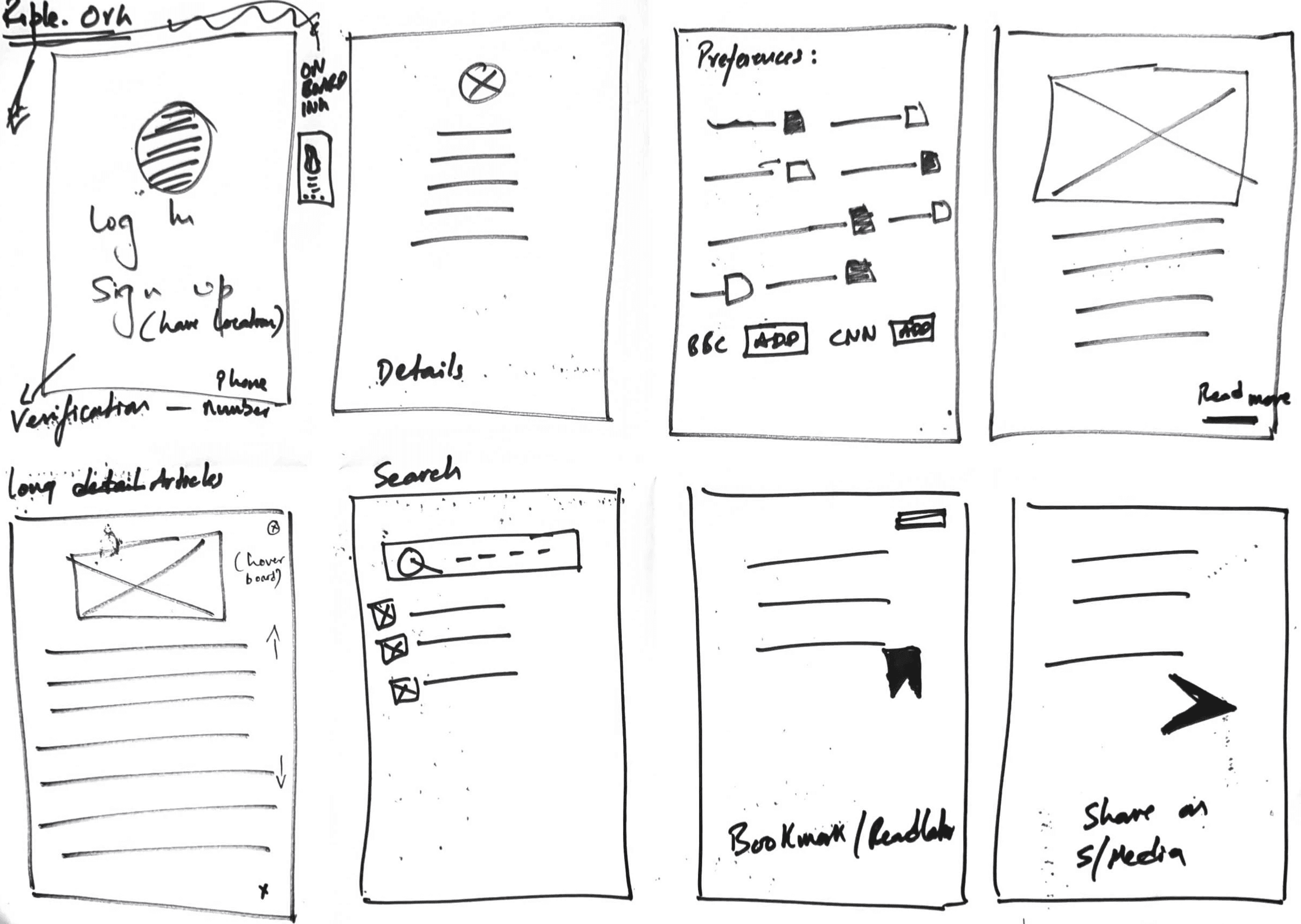
I utilised the Crazy 8’s method to sketch potential solutions on paper which allowed me explore a wide range of approaches
as the constraints meant I couldn’t focus too long on any individual solution.
Roles
A team of three working together on user research, with each member to design a distinct user interface of the app.
Duration
2 Week design sprint at Experience Haus.
From this juncture in the project, we diverged to pursue our design processes independently.
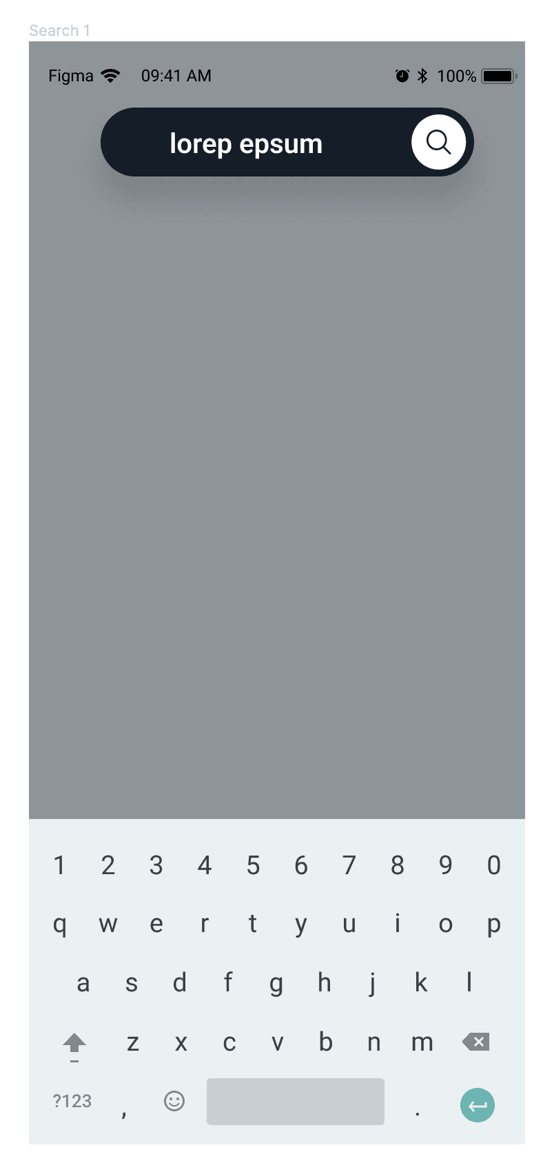
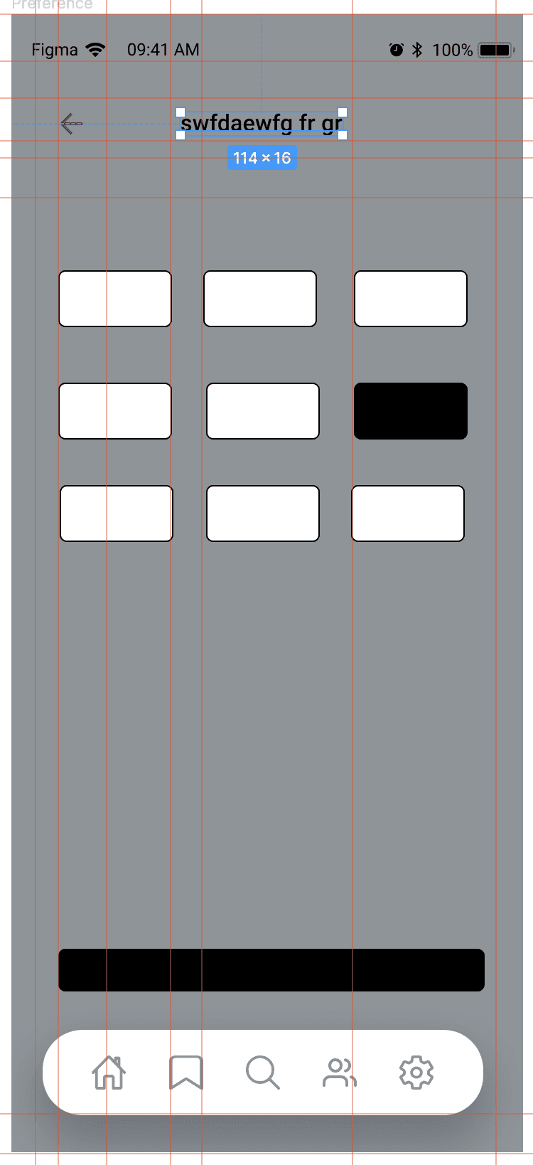
LEARNING:
Users questioned ,what the
"subjects" category meant?
REVISION:
Make explicit that
users can select
the subject category
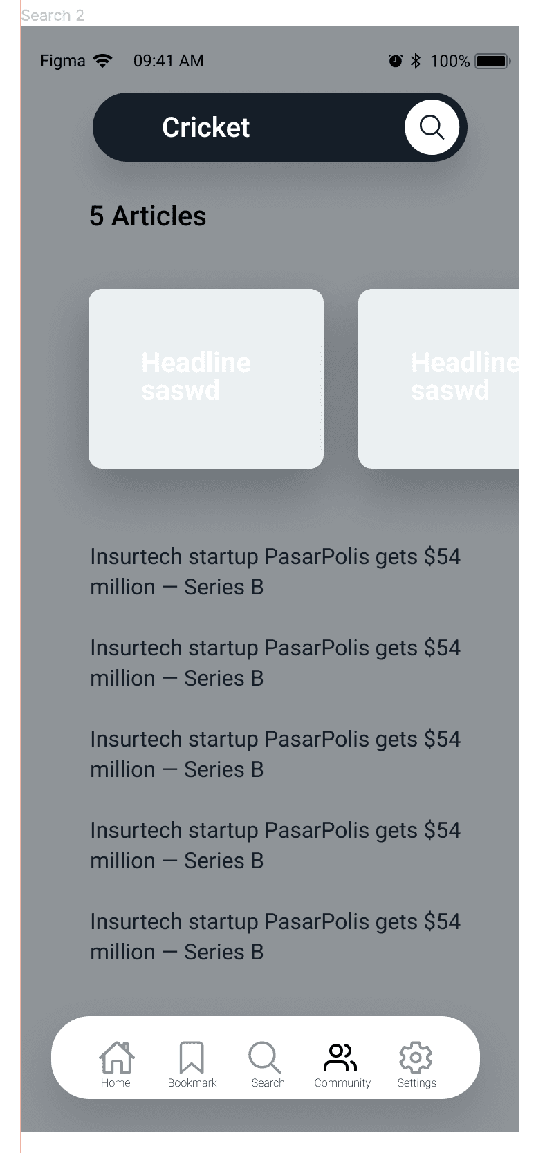
REVISION:
Users could understand,
the carousel allows them
to view different headlines
& view news in a
summarised articles.
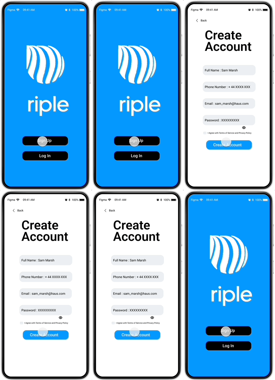
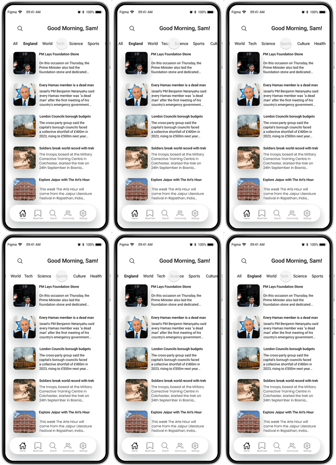
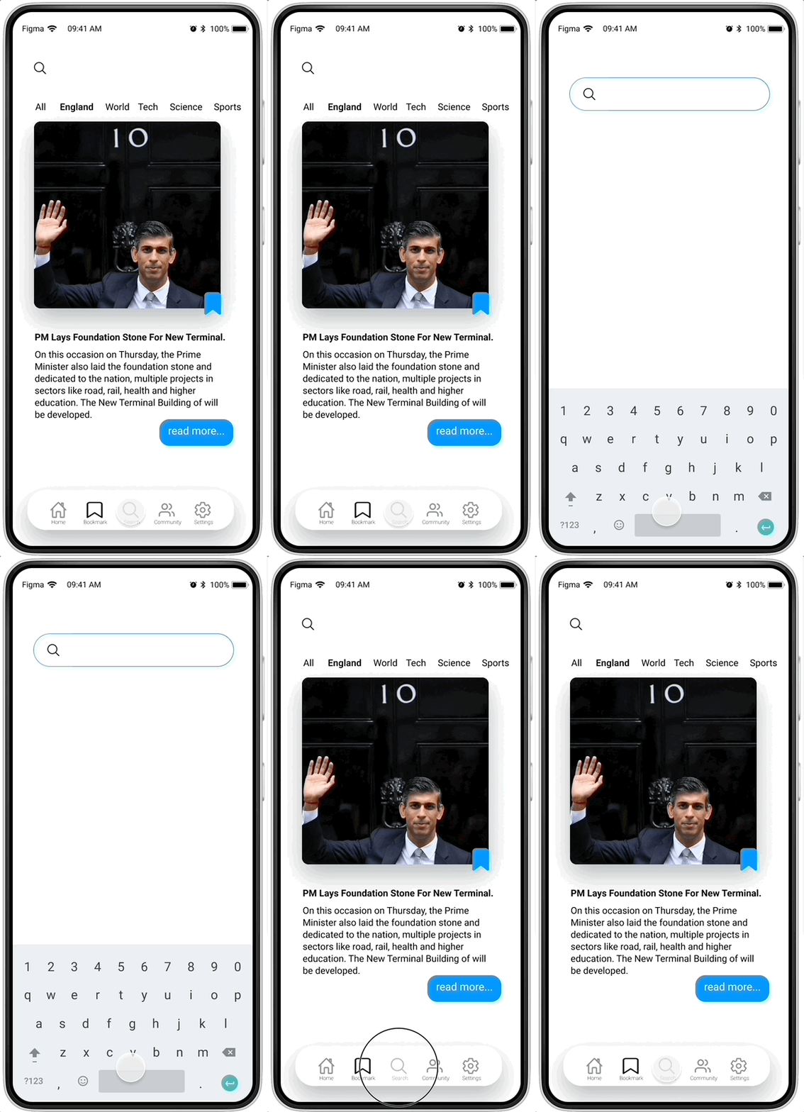
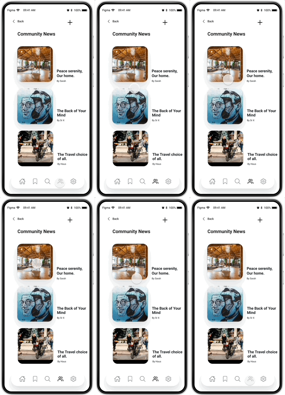


- Conduct more usability tests
Explore alternative methods for incorporating additional sources into article posts.
Discover various methods the app can utilise to present different content types, such as short videos.
Experiment with personalised content recommendations to enhance user engagement.
Implement user feedback mechanisms within the app to gather ongoing insights for continuous improvement.
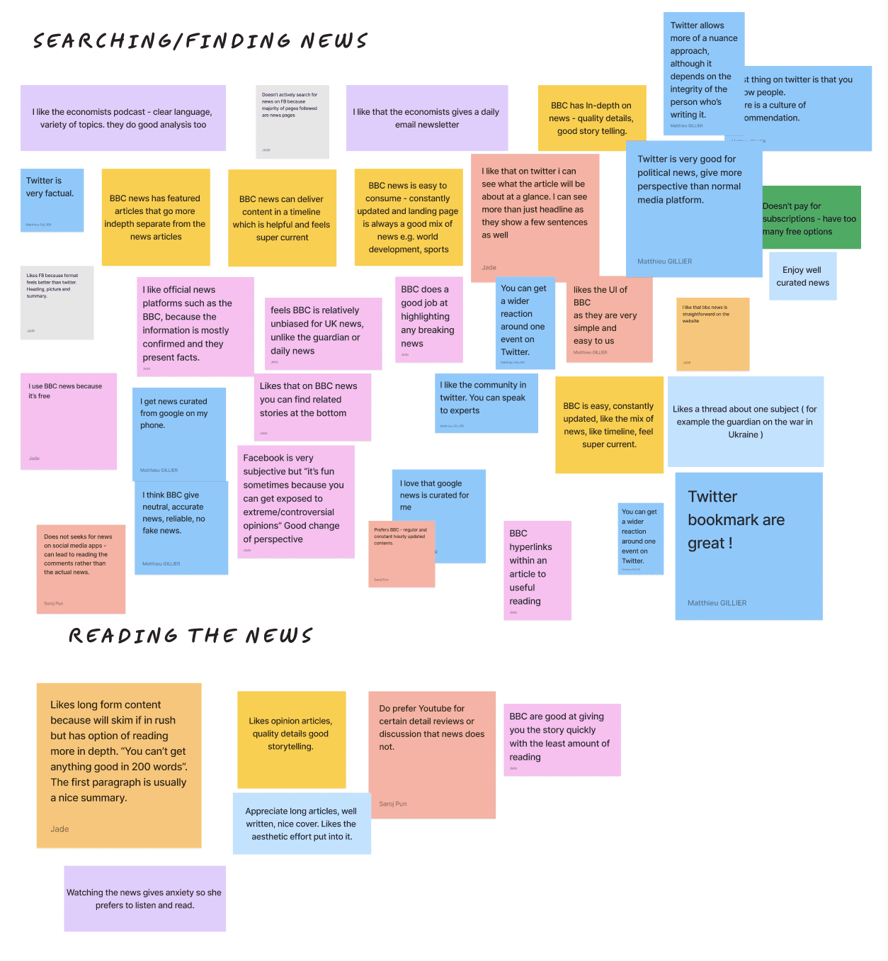
To distill the multiple data points, we created an affinity mapping exercise to pinpoint recurring themes and patterns.
Certain clusters of topics emerged, including:
Sources and the news credibility,
Engagement across online platforms,
Considerations of time and convenience.
LEARNING:
Users were unsure, what
other subjects
could be searched?
REVISION:
Make slight changes
to the design, stating
"search" text as well.
2023 Saroj Pun. Crafted with dedication and love. Often updated.